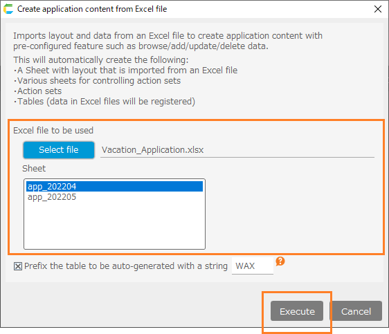
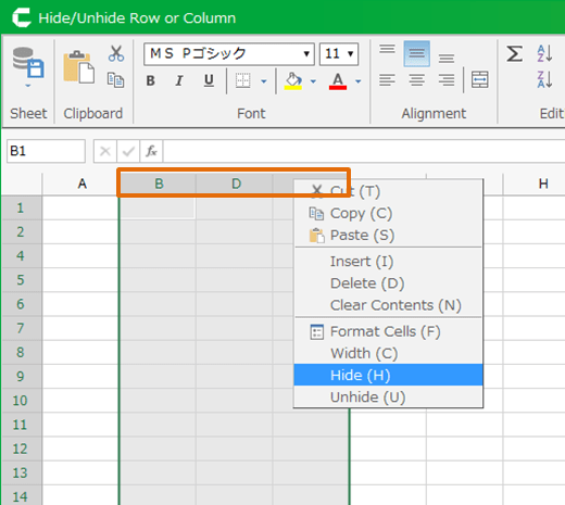
Add Graph In Sheet
CELF can insert the following Graphs into sheet by referring data set into cell.
- XY chart (Line chart, Bar chart etc)
- Pie chart
- Scatter chart
- Combo chart
Add Graph
Basic operation
- Prepare necessary graph data to adjust and insert into sheet like this.
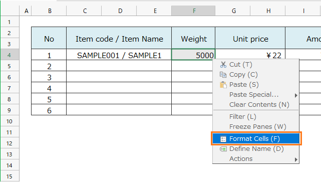
- Select the cell to insert graph, and then click 'Chart' button in 'Input format' in ribbon menu.
- Select the type from tab to create graph in 'Chart configuration' dialog, and then set graph data.
- Click 'OK' button.
Insert XY chart
- Prepare graph data like this.
- Open 'Chart configuration' dialog, and then open 'XY chart' tab.
[1] Chart type
Select chart type.[2] Chart data range
Select cell range to include data to display as graph.[3] Horizontal Axis Label
Select a range of cells in a single column that contains the values to be the labels for the horizontal axis. The number of values must match the number of rows of chart data.[4] Legend items
Select a range of cells in a single row that contain values to be used for legend items. The number of values must match the number of series in the chart data.[5] Item Color
Select a range of cells in a single row that contains the color specification to be used for each graph data series. The number of values must match the number of graph data series.Hint
The combination between XY chart of above field and graph data of cell is like this.
- Click 'OK' button.
Tip
Created each type of XY chart is like this.
Insert Pie Chart
- Prepare graph data like this.
- Open 'Chart configuration' dialog, and then open 'Pie chart'.
[1] Chart data range
Select cell range to include data to display as graph.[2] Element labels
Select a range of cells containing values to be displayed as labels for each element. The number of values must match the number of rows of graph data.[3] Data series names
Select a cell range that contains a single row of data series names. The series name is displayed as a tooltip. The number of values must match the number of series in the graph data.[4] Element colors
Select a cell range with one row containing the color specification to be used for each element. The number of rows in the range must match the number of series in the graph data.Hint
The combination between pie chart of above field and graph data of cell is like this.
- Click 'OK' button.
Tip
Created pie chart is like this.
Insert scatter chart
- Prepare graph data like this.

- Open 'Chart configuration' dialog, and then open 'Scatter chart'.
[1] Chart data range
Select cell range to include data to display as graph.[2] Element labels
Select a range of cells containing values to be displayed as labels for each element. The number of values must match the number of rows of graph data.[3] Data series names
Select a cell range that contains a single row of data series names. The series name is displayed as a tooltip. The number of values must match the number of series in the graph data.[4] Element colors
Select a cell range that contains the color specification to be used for each element. The cell range must have one row and the same number of columns as the number of data series (the number of columns in the data range - 1).Hint
The combination between Scatter chart of above field and graph data of cell is like this.
- Click 'OK' button.
Tip
Created scatter chart is like this.
Insert combo chart
Combo chart can display by combining with below XY chart.
- Line chart
- Bar chart
- Stacked bar chart
- 100% stacked bar chart
- Prepare graph data like this.
- Open 'Chart configuration' dialog, and then open 'Combo chart' tab.
[1] Using Y axis
Select using Y axis in the chart component.[2] Chart type
Select chart type.[3] Chart data range
Select cell range to include data to display as graph.[4] Horizontal axis labels
Select a range of cells in a single column that contains the values to be the labels for the horizontal axis. The number of values must match the number of rows of chart data.[5] Legend items
Select a range of cells in a single row that contain values to be used for legend items. The number of values must match the number of series in the chart data.[6] Element Colors
Select a range of cells in a single line that contains the color specification to be used for the chart data series to be combined. The number of values must match the number of series in the chart data.[7] 'Remove this chart' button
Delete the chart settings being displayed in combo chart tab.[8] '+'('Add chart' to combo chart) tab
Add a new chart for combo chart settings.
- Click 'OK' button.
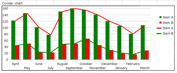
Tip
If barchart and line chart is combined with above data, combochart is like this.
Related keywords
chart, diagram, distribution, transition, change, breakdown, comparison