Customize the operation of the app
Finally, you can customize the operation of the app. You can perform the following customizations for the selected table.
- Change the display order of columns
- Change the display label of a column
- Set the visibility/editability of columns
- Set the input/display method of columns
- Set input check for columns
- Setting up the master for columns
- Setting up related tables
- Improve App Usability
Tip
Even without any customization, the app will work. Since you can customize later, let’s check the operation without customization.
Change the display order of columns
In the dialog that appears when you click the 'Sorting and grouping' button, you can change the display order of the columns.
The display order affects the search conditions and list on the search list screen, the display items on the reference screen, the display/input items on the update screen, and the input items on the new registration screen.
Change the display label of a column
You can change the display label from the default column name.
The display label affects the labels of the search conditions and list on the search list screen, the display items on the reference screen, the display/input items on the update screen, and the input items on the new registration screen.
Set the visibility/editability of columns
You can specify whether to use columns for display/editing on each screen.
The display/editing on each screen is controlled as follows by the on/off of the check.
Set the input/display method of columns
The input/display method can be changed according to the data type of the column.
The relationship between the data type and the selectable input/display methods by the data type is as follows.
Tip
- The "link" opens the specified URL in a separate browser tab. The supported URL schemes are http, https, mailto, tel, and curl.
- For "Camera", please also refer to Using Camera Feature
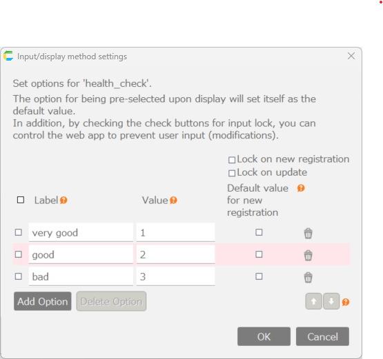
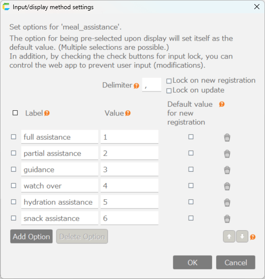
Configure options for columns
If you choose the input/display method from dropdown list, radio button group, checkbox group, or checkbox, you can click the 'Set' button to configure the options or checkboxes.
Settings dialog for options of dropdown list and radio button group
Tip
- "Label" in the settings dialog refers to the label displayed on the screen, while "Value" refers to the value that is saved as data in the table.
Settings dialog for options of checkbox group (specify delimiter)

Settings dialog for options of checkbox
Set initial values for columns
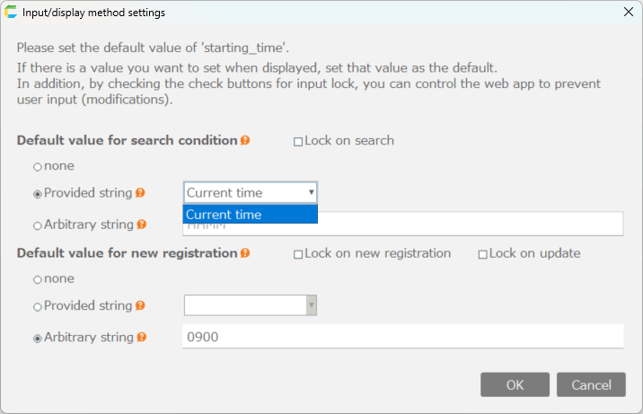
For input/display methods other than "Camera", you can set initial values by clicking the "Set" button. There are two types of initial values: "Default value for search condition" and "Default value for new registration", and they are displayed as initial values on the following screens respectively.
- Default value for search condition
- Can be set for columns used in search condition.
- Set initial values for columns in the search condition section of the search results screen.
- By checking "Lock on search", you can prevent changes to columns in the search condition section of the search results screen.
- Default value for new registration
- Can be set for columns to be edited.
- Sets initial values for columns on the new registration screen, circulation registration screen, and application approval screen (only when the column value is empty).
- By checking "Lock on new registration", you can prevent changes to columns on the new registration screen, circulation registration screen, and application approval screen.
- By checking "Lock on update", you can prevent changes to columns on the update screen and application screen.
The initial value setting methods for each input/display type are as follows:
Setting initial value for String, String (Multi-line), and Password
Setting initial value for Link
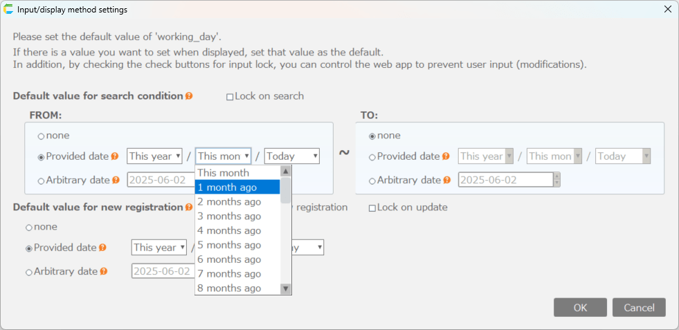
Setting initial value for Year/Month
Setting initial value for Hour/Minute
Setting initial value for Dropdown List and Radio Button Group
Setting initial value for Checkbox Group
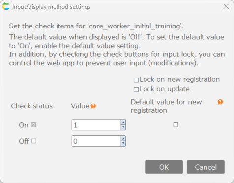
Setting initial value for Checkbox
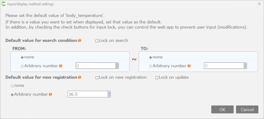
Setting initial value for Integer, Integer (with digit separators), Numeric, Numeric (with digit separators)
Setting initial value for Date
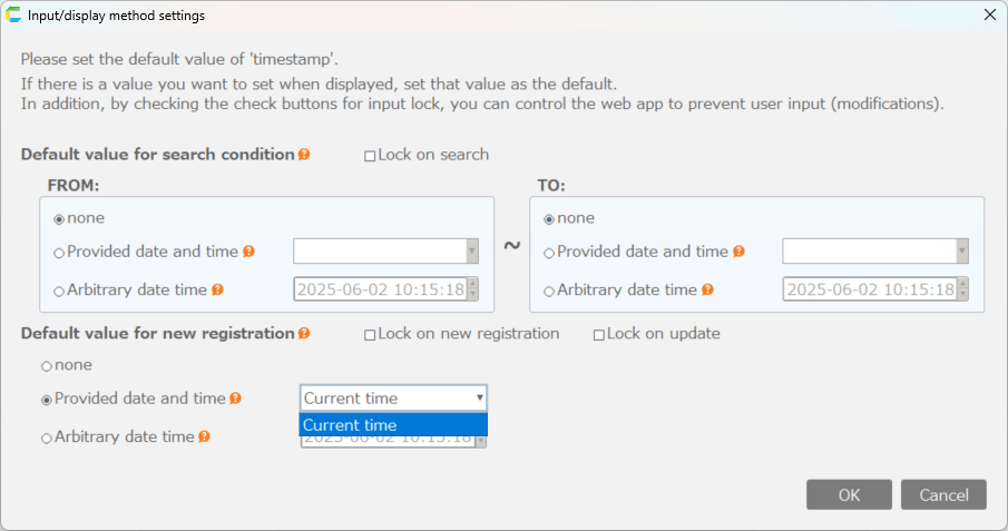
Setting initial value for Date/Time
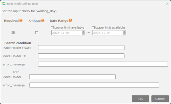
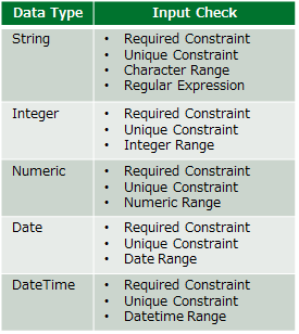
Set input check for columns
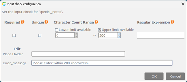
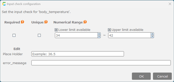
You can change the input check depending on the data type of the column. If the data entered violates the input check, an error will be displayed and you will be prompted to re-enter. You can also customize the placeholder text to provide input examples, as well as modify the error messages. Placeholder text and error messages can be specified separately for columns used in search conditions and those used for editing.
The relationship between the data type and its possible input checks is as follows.
By clicking the 'Set' button, you can set input checks for each data type.
Settings dialog for String (for "Camera", only required constraint and file size limit can be set.)
Settings dialog for Integer and Numeric
Settings dialog for Date and Date/Time